Brand book · Identity 2026
A name that means to grow. A mark that shows how.
Everything Medra puts in front of a customer is held apart in two registers. The interface is bone paper and near-black ink, one hairline and almost no shadow. The brand is a nine-colour photographic gradient, grained and cropped past recognition. This book starts with the name, explains the mark, and sets the colours, the type and the rules for keeping the two registers apart.
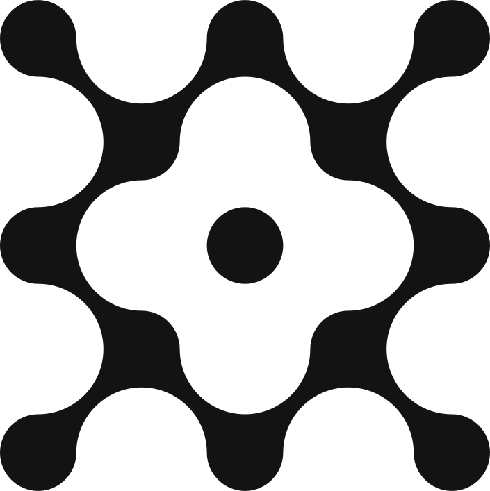 Isotype · dark on bone8-unit grid
The name: medrar
EtymologyMedra is the third person of the Spanish verb medrar: it grows, it thrives. It is what we want to happen to every customer relationship we are handed, and it is the standard the agents are measured against. A conversation that does not leave the account better than it found it has not done its job.
medrar
[me'ðrar] · Spanish · v. intr.
From Latin meliorare, to improve. The same root as mejorar.
- Of an animal or plant: to grow, to gain size, number or strength.
- To prosper; to improve one's social, economic or professional standing.
syn. to grow, to flourish, to thrive, to prosper. ant. to fail, to wither, to decline.
Both senses are deliberate. The first is organic: the mark is a flower, and the photographs behind the brand are botanical and marine. The second is commercial: our clients hire us so that their customers, their accounts and their teams gain size, number and strength. The wordmark is set in lowercase because the verb is something that happens to you quietly, not something announced.
The mark and what it means
IsotypeThe isotype is a flower built from one repeated module: a circle. Read from the centre outwards. The centre dot is the flower itself, Medra, from medrar: to bloom, to grow. Around it, the module repeats outwards at the four vertices, which signifies expansion. Every outer node is a conversation. The corners are rounded because rounded corners mean closeness: the mark is a living network of conversations that grows from a single point, not a circuit diagram.
- 01Centre dot: a flower. Medra comes from medrar, to bloom, to grow. It is the origin of the whole form and the unit of its clear space.
- 02Repeated module: the same circle repeats outwards at the four vertices. Repetition in the four directions signifies expansion.
- 03Outer nodes: every outer node is a conversation. They are equal in size because no conversation and no channel is secondary.
- 04Rounded corners: every join is a soft fillet. Rounded corners mean closeness, the tone we want every conversation to have.
Logo system
Four lockups · three versionsThe wordmark is a bespoke lowercase face by Serial B × DumDum Studio. It is never re-set in type: all usage goes through the supplied files. Each of the four lockups (wordmark, isotype, horizontal, vertical) ships in dark ink, mid-grey and bone, for light, low-emphasis and inverse placements respectively.
Dark #141414 on light
Default. Headers, letterheads, documents.
Light #efefea on dark

The negative version. Footers, the closing block, inverse surfaces.
On texture always under a scrim
Permitted only over a darkened texture. The scrim protects the mark.
Horizontal lockup nav bars, letterheads
Isotype height equals the wordmark's x-height plus ascender. Gap equals two centre dots.
Mid-grey #9a9b98 · watermarks
For low-emphasis placements: watermarks, slide corners, secondary partners' pages.
Colour
Three neutrals · one spectrumThree neutrals carry everything. Colour arrives through texture and through one accent at a time; it is never sprayed across a layout. The identity gradient decomposes into nine colours, and it is a spectrum, not a palette: draw one for an accent, never four on one surface.
- Bone#efefea · neutro claro · the page
- Ink#141414 · neutro oscuro · text, inverse surfaces
- Grey#9a9b98 · neutro medio · secondary marks
- #d33766
- #123c1e
- #5a9c12
- #ffb276
- #f25d23
- #781642
- #249aba
- #d1c935
- #1d6cf2
Typography
Inter, and only InterInter was chosen because it was drawn for screens. There is no second family: weight and tracking do the work. Regular weight at large size, tracked tight, is the brand's signature; display type is never set in semibold. Figures are tabular wherever they sit in a column or update live.
- Display400 · 52–116px · −0.025emRecovery with criteria, not pressure.
- Heading400/500 · −0.022emEvery conversation is answered. Most of them end there.
- Body400 · 16–18px · 1.55The agent reads the thread, checks the account state, and replies. It escalates only when the answer would require a decision it cannot make.
- Eyebrow500 · 12px · +0.14em · capsCoverage · What it does · August 2026
- Number400 · tabular · unrounded1,284
Texture and the plinth
The sócaloThe identity images are marine and botanical photographs, motion-blurred and grained at source. The rule is explicit: use only segments of the images, and prioritise colour gradation and hints of organic form over the content of the picture. Crop to an off-centre half of the frame. The viewer must not be able to identify what the photograph was of. Never a CSS gradient where a texture belongs.